Feature Post
Popular Post
Subscribe Newsletter
22 Best Fonts For Business Cards That Look Impressive
- BY, Admin hdghdfgdfgdfg
- 20 Nov, 2024
- 09:04
A perfect Business card doesn’t depend only on design, color contrast, or a fancy look. You have to make something that highlights your profile to the audience at first sight. In that case, choosing the right font plays a vital role.
Today, we are going to discuss about 22 best fonts for business cards. Go through this article and choose the perfect font, size, and style for your card.
Table Of Content
- Why Fonts Are Important For Business Cards?
- Top 22 Fonts For Business Cards In 2024
- The Best Serif Fonts For Business Cards 2024
- The Best Sans Serif Fonts For Business Cards 2024
- How To Find The Best Fonts For Business Cards?
- FAQ
- Conclusion
Why are Fonts Important for Business Cards?
To make the card more eye catchy and unique it is very important to choose the right font. Actually, your cards look solely depending on the fonts that you use. In the USA, the average business card size is about 3.5 x 2 inches, so you will have a short space (compact space) to show your creativity with designs.
However, here are some points to let you know why card fonts are important.
- First Impression: A perfect font can make your card more attractive. In that case, you need to select the right font style that aligns with your brand.
- Brand Identity: Sometimes, people can also identify you with the font of your card. So, before choosing any font, you need to be very careful. However, you can get expert assistance while choosing a font.
- Uniqueness: A unique font will keep you exceptional from competitors. These changes will create a good impression on the audience.
22 Best Fonts for Business Cards In 2024
You can use both Serif and Sans Serif typefaces. But you may want to know
Which Typeface is Best for Business Card Designs?
The answer is that sans serif font is the best typeface for business cards. This is because sans-serif fonts are easily readable and look more professional.
But you can use a serif typeface as well. Actually, if you use both serif and sans serif fonts together, then it will be more attractive and eye-catchy. To make it more specific, we have listed the best fonts for 2024. You can choose any of them or multiple fonts for your cards.
So, let’s start with top-serif fonts.
7 Best Serif Fonts for Business Cards
In this list, you will find 7 best serif fonts that you can use. But before choosing any font, make sure it matches your brand.
Now select a font from below.
1. Times New Roman
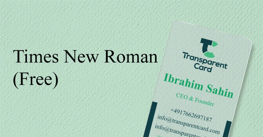
Times New Roman is an excellent serif font for it. This will be best for those who are looking for a simple design.
2. Baskerville

John Baskerville designed this highly readable serif font in the 1750s for book lovers. You can use this font on the body text of your card, such as the address, name, etc. This font is much better at portraying how trustworthy and credible you are.
3. Baltica
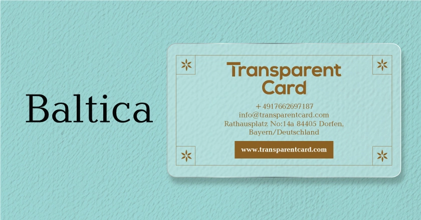
Baltica is a modern and attractive font style. The letters of this font are slightly rounded, which looks good in the name, logos, and qualifications texts. However, this font is best for startups or small businesses who want to create a new brand.
4. Bodoni
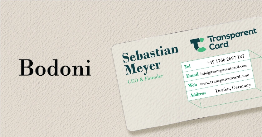
Bodoni is a high-contrast font with sharp lines. The Bodoni family first introduced this font in the 18th century. Because of its thick strokes and elegant serif lettering, this font has become popular recently. It is mostly used in luxury brands and creative industries.
5. Trajan
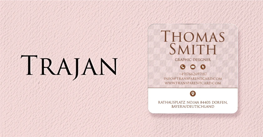
Trajan font is mainly focused on traditional brands. It is a reformed version of ancient Roman inscriptions. It is popular among those who want to showcase their prestige or power. This font is suitable for law industry cards.
6. Buenard

Buenard is a modern serif font. Its structure is similar to the Roman classical structure, which has less contrasted marks and dense serifs. The font looks good in every size and is appropriate for name and heading sections.
7. Garamond
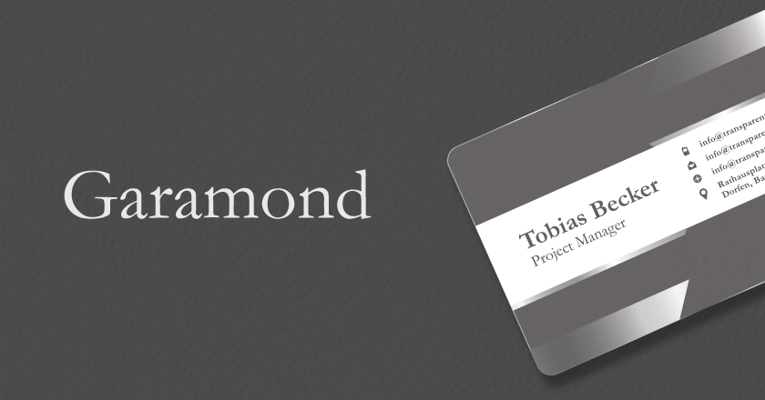
Garamond font is suitable for reading small texts on cards. It is ideal for those who want to have a classy look on it. If you are someone from the law, consultancy, or finance industry, then this font is suitable for you.
15 Best Sans-Serif Fonts for Business Cards On Trend
Sans serif fonts are best to use on visiting cards. But why Sans-Serif fonts are best for visiting cards? This is because those fonts are more professional, easy to read, and provide a clean look to your card. Now check the list below and use stunning fonts for your cards in 2024.
1. Helvetica
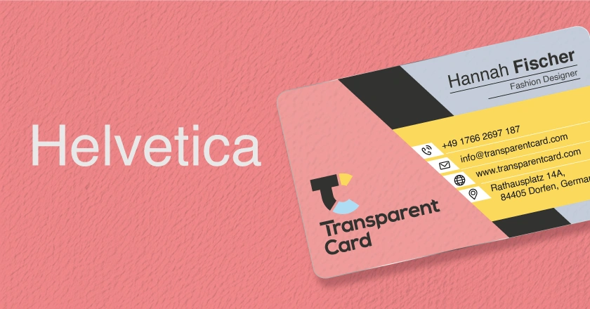
Helvetica is suitable for several industries. In fact, many businesses use Helvetica fonts officially. This font is clean, easy to read, and more professional. Moreover, it will carry your message more effectively on your card.
2. Futura

Futura font is perfect for technology, fashion, and design industry. This font is suitable for making flawless designs on cards. However, if you want to make your cards more special, then you should use this font.
3. Black Caviar

Black Caviar is one of the best fonts for card designs. This font is best for the signature part because of its humanitarian touch and handwritten letter types, which similarly look like human writing. Moreover, this font has several variations, so you can use it to make a unique card.
4. Riviera

Riviera is a capitalized font, which is perfect for logos. This font has a good space, which makes it easy for the audience to read. Moreover, you can use this font to highlight any text or hook lines on your card.
5. Roboto

Roboto is one of the most used fonts for cards. This font has 6 different variations and 28 alternative modes. Moreover, for its mechanical feel and curved letters, this font has been used mostly by tech companies and startups.
6. Lato
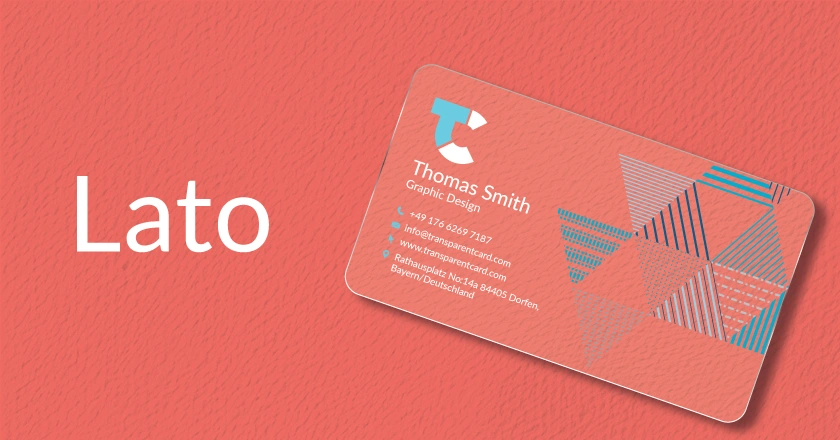
Lato is one of the latest sans-serif fonts for cards. This letterform is suitable for various areas on your card. Though this font’s semi-rounded letters make the text more friendly, its strong structure makes it more stable and worthy.
7. Montserrat
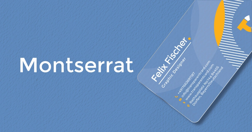
Montserrat is one of the best fonts for card design. If you want to reflect it as promotional material, then this font is suitable for you. Moreover, you can use this font on banners, logos, and leaflets as well.
8. Quattrocento

Quattrocento is one of the most sober, elegant, and classy fonts for cards. The specialty of this font is you can read all the text easily, even in small sizes. So, this font is suitable for taglines, logo text, and web addresses as well.
9. Proxima Nova
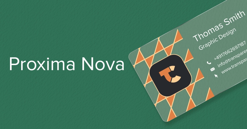
Proxima Nova is known as one of the best readable fonts. The font fits well when used for small-sized texts. People in the tech and creative industry prefer using it for their cards.
10. Comfortaa
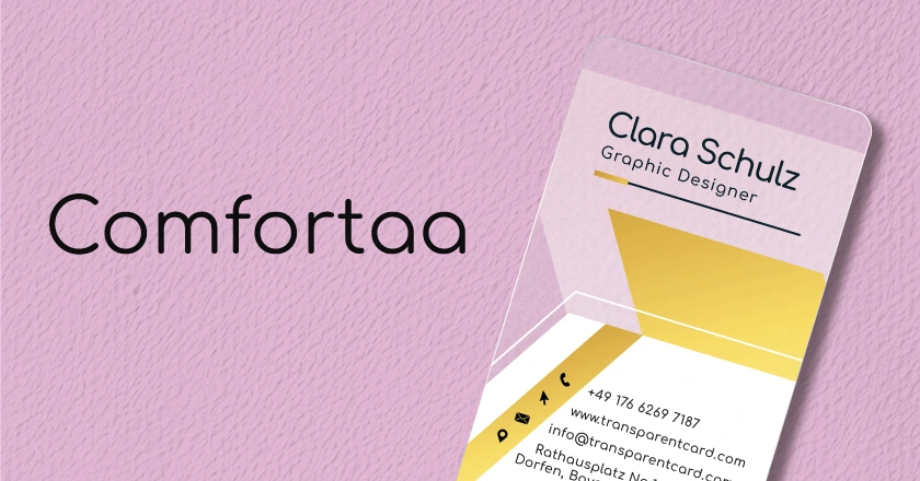
Comfortaa is a rounded typeface that is suitable for titles, names, and logos. It is one of the best fonts for large font sizes.
11. Rajdhani

Rajdhani font can be used this font both formally and casually. This sans-serif font takes less space on it. So if you want to make a restaurant visiting card then this font will be best for you.
12. Alegreya SC

Alegreya SC is one of the best fonts for capital text on cards. By using this font, your text will have a minimal height. This font is best for those who are looking for a simple design in short details.
13. Arial
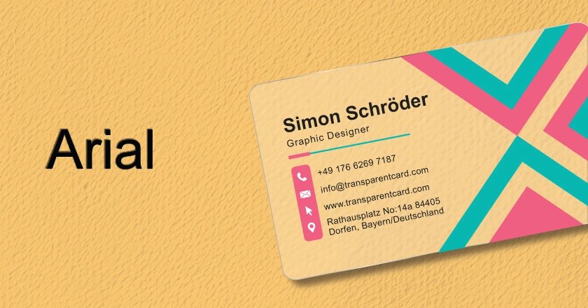
Arial is one of the most popular fonts for cards. This rounded font has several styles and sizes to decorate it properly. Moreover, it is very easy to read and one of the most used fonts for cards, which is why this font is as popular as most professional fonts.
14. Oswald
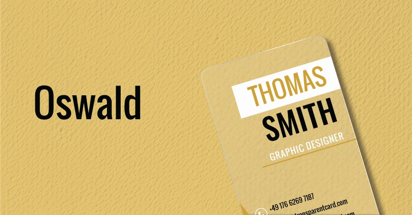
Oswald is a bold and impactful font for cards. This font is perfect for startups and tech-related companies. With this font, you can easily create a simple and effective design.
15. Calibri
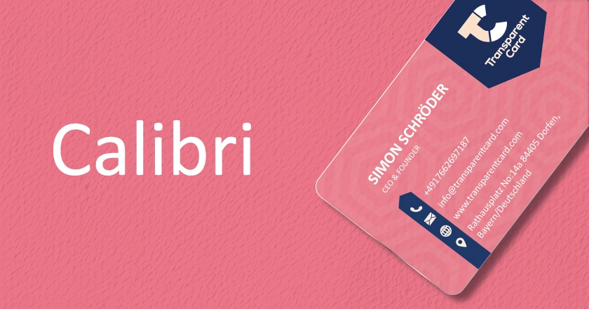
Calibri is one of the most standard fonts for cards. This font is simple but very eye-catching when you want to deliver a message through a card. However, you can use this font to design any industry card.
What is The Best Font Size for A Business Card?
On average, you can keep 7-11 pt font size for business cards. However, from an audience perspective, 10pt is a standard business card font size. We can use multiple fonts together so that you can also change font sizes according to your needs.
You need to research your competitor’s design, logos, and sequences. Now check the instructions below to know how to choose the best visiting card fonts.
How to Choose the Best Fonts for Business Cards?
Font style is one of the significant factors of it. Before choosing any font, you must be aware of font size, industry trends, and readability.
Now, you may have a question:
Easy to Read
Before choosing any font, first identify which one will be easy to read. But remember, you can’t use random fonts for your card. You need to select a font that perfectly matches your industry. As it has very small space, you should choose fonts with minimal letter space, letterforms, and line height to ensure easy reading.
Use Eye Catchy Fonts
If you want to showcase any points of your card, then you may want to bold the text. But sometimes, the text becomes hard to understand in some fonts. So, you need to select a font style that will be easy to understand.
Choose Multiple Fonts
Yes, you can use multiple fonts to create your card. For example, if you are a restaurant owner, you can use Rajdhani font on the body text and Futura for logo design. But you shouldn’t use random fonts on your card. We suggest you implement no more than 2 to 3 fonts on it.
Select Industry Relevant Fonts
You need to select an industry-relevant and audience-expected font. As we said earlier, your font could be your business’s identity, so you should be careful before choosing any font.
Use Classic Fonts
Every day, we have been introduced to a variety of new fonts. People use those fonts for a certain time, and soon, they are replaced by another one. But there are some evergreen fonts, like Helvetica, Garamond, or Times New Roman, which will be a better option in the long run.
FAQ
What is the readable font size for a business card?
10 PT is the most preferable font size for business cards. However, you can use multiple font sizes on a single card. But remember, never use any font size over 11 PT or below 7 PT.
Can we use different fonts to work together in your business logo?
Yes, You can use multiple fonts for logos, body text, and addresses. But you need to choose industry-relevant fonts for your card. Moreover, you shouldn’t use more than 3 fonts on it.
What are the most popular business card fonts?
You can use both serif and Sans-serif typefaces. Therefore, fonts like Times New Roman, Baskerville, and Helvetica are famous for visiting cards.
How to make a unique business card?
First, you need to choose an unique design. After that, insert an eye-catchy logo and multiple fonts to make it unique. However, you can check our collections, where you will find 500+ templates in 190+ different categories.
How to customize business card fonts?
Well, it is challenging. You need to know about industry trends. Moreover, you need to adapt some skills, like editing and competitor analyzing. So, it is better to use readymade designs. You can take a look at our free templates.
Conclusion
Before choosing any fonts, you have to be very careful. However, we have suggested 22 of the best fonts for business cards. You can use them according to your industry and needs. From our point of view, you should use both serif and sans serif fonts together to design a perfect one. For more updates, keep an eye on our blog section.
Have a nice day.
No tags found.


